


Build Your Brand
For the second article in our series on how to create a digital press kit, we look at photography. If you missed our first installment on writing a bio and press release, go back and read it in our September-October 2023 issue. Next up: how to design concerts and back them up with audio and video demos that will have audiences clamoring for more, coming up in our January-February 2024 issue.
If a picture is worth a thousand words, what do your professional photos say? Potential clients often see your photo before they hear your music, and you want that first impression to be a positive one. Your style, artistry, and creativity should shine through your photos. Each shot of you that appears in publicity materials, on your website, and on social media should convey your professional image.
Whether you think your photos need a refresh or you are ready to have your first publicity shots taken, we’ve got a few simple tips to help you avoid common pitfalls and end up with a gallery of fabulous photos.
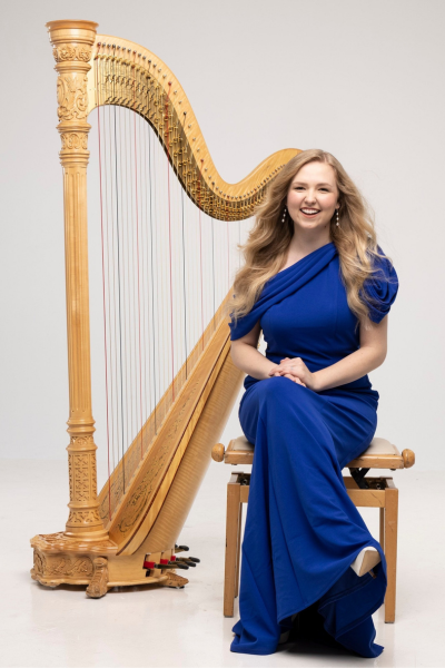
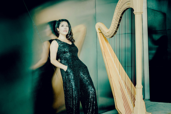
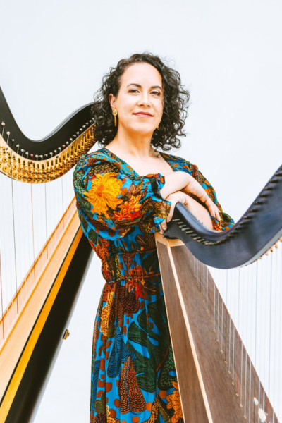
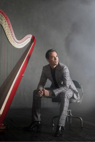
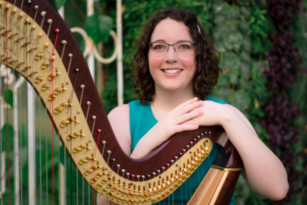
Check out great publicity shots from professional harpists.
What makes a good photo? First of all, it’s a photo that showcases you and your personality. Make sure you’re front and center. You want a professional look that communicates your own professionalism. Update your photos often so that they accurately represent you. Use your imagination and get creative with settings and poses. Work with your photographer to ensure that you stand out with good lighting, angles, colors, and contrast. When sending your photos to the press, anticipate the ways your photos may need to be adjusted and think about which photos fit best within that context. Make your photos easy to find and download from your website, in high resolution and with a user-friendly file format. For more ideas, check out our sidebar for examples of great publicity shots from other professional harpists.
Here are some tips and ideas to consider when you’re at your next photo shoot.
Create a professional look


DO aim for photos that showcase you
DON’T hide behind the harp
DO present a professional look
DON’T use a selfie for your promo shot
Your professional photos should be just that: professional. Make sure it’s a good photo of you. It doesn’t necessarily have to feature your instrument; you are the focus of the photo. The background of your photo and the clothes you are wearing shouldn’t distract from you, the harpist.
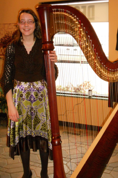
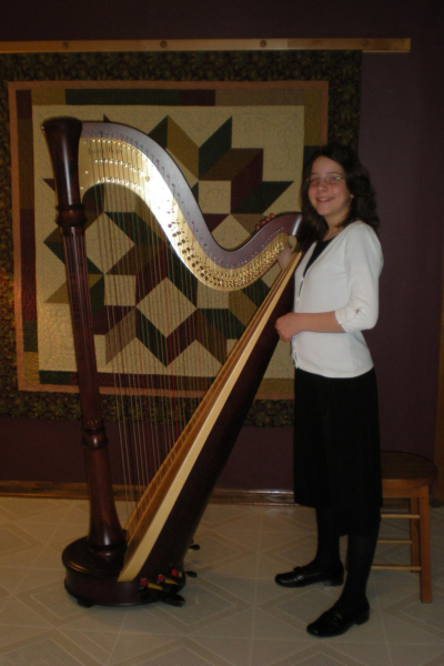
Example 1 is a great illustration of what not to do. When you look at this photo, what is the first thing you see? Probably it’s the Christmas tree, not the harpist. Maybe you also tried to count how many gifts there are under the tree. Not to mention, the quilt dominates the background. This is why it’s a good idea to consider the background of your shot. Does it enhance your professional photo? Or does it take the viewer’s focus away from you?
Example 2 clearly was not snapped by a professional photographer (and I’m not very skilled at taking selfies!). The lighting is less than ideal—bright light is reflecting off my glasses. I’m wearing a T-shirt and my hair is a little frizzy. There’s also a lot of clutter in the background.
Example 3 is finally moving in the direction of a professional photo, but it still has a ways to go. While I’m sitting in a professional-looking pose, the background needs some help. It’s neither a photography-studio curtain nor a picturesque outdoor setting. It’s simply some household blinds.
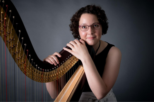
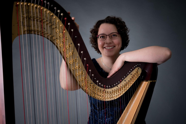
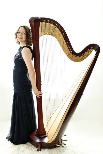
Example 4 is a professional photo taken in a photography studio. Here’s where you can get creative. You or your photographer can try all kinds of poses. Or you can have your photographer snap photos while you’re laughing or while you’re playing. You can look directly at the camera, or you can look away at an artsy angle. Try different ideas and see what you like.
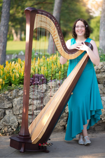
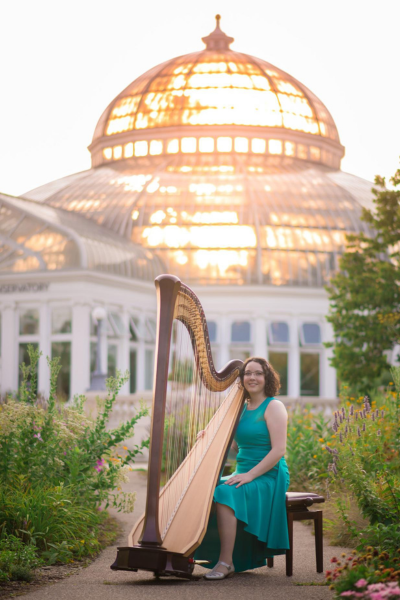
Example 5 shows an outdoor background, or “on-location shot.” This is another opportunity to showcase your personality. I enjoy flowers and gardens, so I chose to have one of my on-location shoots in a garden. You could also choose the location based on the feel it creates. For example, standing below a bridge or in front of a mountain landscape might create a dramatic effect. Or you might want a more casual shot with an urban backdrop.
Stay current
DO take new photos regularly
DON’T follow old artistic trends
Your professional photos should be up to date—a recent representation of how you look. Also consider whether the composition and setting of the photos is artistically up to date. If your photos use a backdrop that was trending five years ago, that might be a giveaway that you haven’t had new photos in a while.
Show your personality


DO try creative poses in different settings
DON’T have only one publicity photo
When you’re building a photo gallery on your website, or choosing a couple photos to send out with your press release, think about offering a variety of options that show your personality in different ways. Depending on where your photos are used and what they’re illustrating, media outlets may choose different types of images. A more casual photo might be appropriate for some circumstances but not others. Your photo also might be cropped into different shapes, like a rectangle, square, or circle.
Here are some of the choices you might want to offer.
- Headshots and full-length
- With harp and without harp
- Studio and on-location
- Action, playing, and posed
- Color and black-and-white
- Horizontal (landscape) and vertical (portrait), and images that can be cropped to look good either way
Playing your instrument (as in Example 8) is an alternative to posing with a smile (as in Example 7). Example 9 captures a moment in time: I’m dropping the fold of my skirt, and the camera freezes that moment of action.
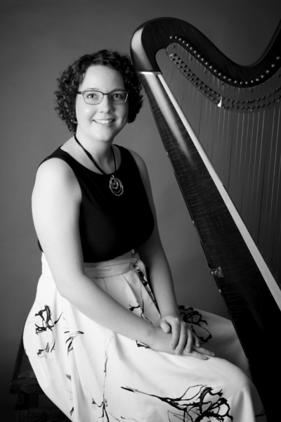
With a quick edit, any color photo can become black and white. If your photos have enough contrast, as we’ll discuss later, they are more likely to look good in black and white. In Example 12, the dress I’m wearing is black with an off-white skirt. That means the photo has plenty of built-in contrast between the light skirt and dark top, which helps it to stand out in black and white.
Sometimes you don’t know whether your photo needs to be portrait or landscape. One solution is using a photo like Example 13. The composition of this photo looks good in both orientations, so the person publishing your photo can crop it to fit their needs.
Guide your photographer
DO communicate your goals to your
photographer
DON’T settle for cliché poses
DO place yourself front and center
DON’T let the harp strings get in the way
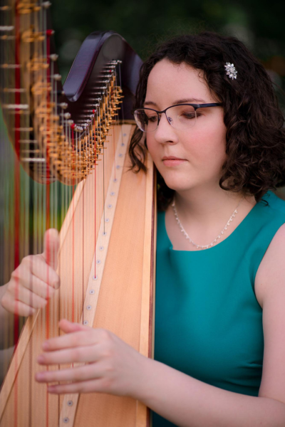
When choosing the best photos from your shoot, consider the lighting and angle. As you’re working with your photographer, don’t be afraid to mention what you like in a photo. Lighting can be the difference between a clear, striking image and a photo that makes it hard to tell what you look like. Check for the contrast in value (lightness or darkness) between your face and the background. The photo should have enough contrast that you stand out from the background. Another thing to consider is whether there are shadows on your face. If there are, do the shadows have an artistic purpose? Or do they obscure your facial features and expression? Similarly, consider whether the photo is taken from an angle that hides your face (for example, the other side of the harp strings). Remember, the person looking for harpists to hire wants to be able to see your face and get a sense of who you are as a person.

In Example 14, the fiery sun lighting up the glass windows becomes the focus of the image. It also makes me and my harp look a bit pale and washed-out.
The shadows in Example 15 don’t contribute to the artistic effect of the image. Far from providing a dramatic flair, the dark mottling of my face makes me nearly disappear into the gray studio screen behind me.
The angle of Example 16 causes the top rim of my glasses to cut halfway across my eyes. Personally, I’m not sure I like the effect! Also consider where your eyes travel when you’re looking at this photo. If you’re like me, your eyes trace the repetitive pattern of parallel strings with vibrant alternations of black, white, and red: back and forth across the span of strings. It’s hard to spend much time lingering on my face.
Every photographer loves the through-the-strings shot. Example 17 is a perfect illustration of the pitfalls of this approach. My face is hidden behind strings that look especially thick because they’re blurred for special effect. More than that, the neck of the harp covers part of my face. I’m also on the wrong side of the harp, yet I’m acting as if I’m playing it. If I used this photo for a press release, it might seem a little strange to harpists reading my news.
Stand out with color and contrast
DO wear bold colors that highlight you
DON’T blend into the background
DO aim for high contrast
DON’T hide in the shadows
Contrast has two dimensions: color and value. Your photos can use contrasting colors to set you apart from your surroundings. Think about the outfits you’re wearing for your photo shoot. Solid, bright, bold colors provide better contrast than patterned clothing. In general, the more contrast in your photo, the better.

Value refers to the range of light to dark in your image. (See Example 18.) A photo with high contrast in value has a big difference between the brightest highlights and the darkest areas of the photo. A photo with low contrast can be mostly dark, or mostly light, or it can fall in the mid-range between dark and light. Consider avoiding colors that are too close in value to your skin tone, in case the photo is used in black-and-white form.
Example 19 shows less-than-ideal clothing. The patterns on my skirt are distracting. The uneven lighting in this image makes the harp look like it’s broken into segments. The brightest part of the image (the window and white car) and the darkest part of the image (the coats hanging on the wall behind the harp) have nothing to do with the main focus (which is supposed to be me).
Example 20 demonstrates low contrast where most of the image is very light. Even though the harp and my gown are dark, the bright background causes other glaring problems. Look closely at the harp strings near my hand. Part of each string is invisible in the harsh lighting, making it look like two halves of the string are just floating in space. From middle C upwards, it’s hard to tell the harp even has strings at all. Behind me is a background of nearly pure white, which makes it look a bit like I’m floating too.
Example 21 is poor lighting to the extreme. The harp blends in with the backdrop, and my face is as yellow as the floor. Far from a balanced composition, most of the image is nearly the same color and value.
With the exception of my white cardigan, everything in Example 22 is dark. My face is also poorly lit and difficult to see. The quilt in the background adds to the visual confusion.
Sometimes unusual lighting adds compelling creativity to an image. But the lighting in these examples makes the harpist blend in, rather than stand out.
Anticipate the media’s needs


DO provide high-resolution publicity photos
DON’T forget that your photos might be cropped
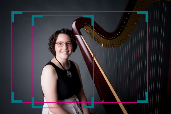
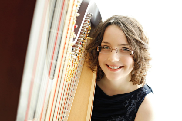
Remember that most of the time, media outlets will crop your photos to only show your head and shoulders. This has several implications. First, if you only offer photos from far away, a close-up of your face will be lower resolution and may appear blurry or grainy (as in Example 23). Consider providing a photo like Example 24 where your face takes up a larger portion of the image, or use a headshot like Example 6.
Second, if off-the-shoulder gowns or spaghetti straps are your style, go for it, but consider offering another option in case your photo needs to be cropped in close.
Third, if you want to make sure the harp is visible in your headshot, place it directly behind you so that it doesn’t get cropped out of the picture. Example 24 shows one way to do this.
Make your photos easy to find
DO display your photos online
DON’T make your photos difficult for the press to download
Your photos need to be available for download online, so that the press can access your photos easily. Try downloading an image from your website to test if it’s in a high-resolution file format. (Check out Techie Talk below for tips on making sure your photo is suitable for publication.)
Consider using a grid-style photo gallery or a gallery that allows you to click through to the next photo. You don’t want the media to have to wait for your slideshow to cycle through all your photos to be able to access the one that works best.
Another step is to label all of your photos with your name and the name of your photographer, if a photo credit should be given. If you’re emailing your photo with a press release, you can also mention the photographer’s name in the body of your email. Always send your photo as an email attachment, rather than inserting it in the middle of the text.
Final Thoughts
Now you’re all set for your next professional photo shoot. Showcase your personality, be creative, and most of all, have fun!
Already in this series, we’ve looked at materials that show who you are and what you’re doing: in words, through your bio and press releases, and in images, through your professional photos. In our next installment, we’ll cover how to create engaging concert programs and market your music in audio and video demos. Whether you freelance at events, tour with a chamber group, or perform solo concerts, it’s important to give your potential audience a taste of what your playing is like. •
Techie talk
Photo resolution measurements are made in dpi—dots per inch—or the number of dots of ink in each square inch of a printed photo.
300 dpi = standard print resolution or high resolution
72 dpi = standard web resolution, sometimes referred to as low resolution
Best photo file formats:
.jpg or .jpeg, .png
File formats to avoid: .webp (low resolution) .pdf (difficult to edit)
Name photo files to make them easier for others to identify by using your name and the photo credit name (if needed). For example: Suzy_Harpist_credit_Phyllis_Photographer
Frame it!
We look at a lot of harpists’ publicity photos here at Harp Column. Here are some of our favorites.