


If you’ve been following along in our “Build Your Brand” series, you now know how to write a smashing bio, take captivating publicity photos, develop a concert proposal, and communicate all of it to the press. In this, our final installment, we’re going to show you how to level it up by bringing everything together on your own website.
Build your Brand
This article is the fourth and final article in our Build Your Brand series. You can read the previous articles on writing a bio and press release, creating fabulous photos, and building and marketing a concert program in the three previous issues of Harp Column.
Disclaimer: a lot of musicians don’t bother with a website when social media does an okay job of getting the word out. But those accounts don’t help you reach everybody, and most people still turn to the web when they are looking for cold hard facts and information (the location and time of your concert that evening, for example, or your bio to print in a program). If you don’t have a readily available way to provide the answers and information potential clients, students, or fans need, you’re leaving an opportunity on the table.
So let’s dive in and get started on your new website right now.
Make a plan
You’ll need to make a few decisions before you begin. Will you do it yourself or hire a pro? What service will you use to create and host your site? What will your domain name be, and is it even available? What colors and fonts will you use? Most importantly, what content will you include on your website? Start by looking at sites of other artists you admire, and make a note of the things you like—and don’t like—about them. Consider design, layout, and the type of content that is—or isn’t—included on these sites.
You’ll need to make some technical decisions about how your website will be built before you can move on to the fun stuff like design and layout. Your website needs a home, and for that you’ll need both a domain name and a host. Website builders like Squarespace and Wix are popular, since a single fee covers hosting along with a basic page builder and templates. These one-stop services also offer domain registration and can be a simple solution if you want to experiment with designing your own site. However, design options can be limited and additional features—like selling your merch—can add up. If you want more control, you can look at a builder like WordPress, which is what we use here at Harp Column. (See our Tech Talk glossary at the end of this article for definitions of some common tech terms.)
If you aren’t sure whether you should go with a DIY approach or hire a professional, start with a web design consultation. They are usually free of charge, and you’ll get a better sense of the scope of the project, the cost, and which approach makes the most sense for you.
What’s Your Style?
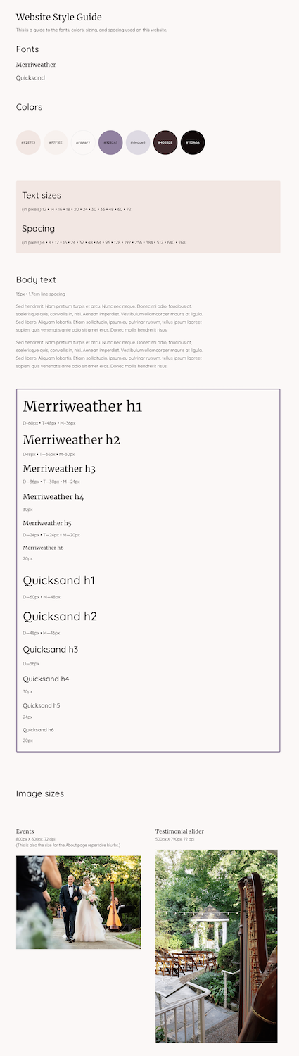

Ex. 1: Creating a style guide will help give your website a cohesive look. Choose a palette of complementary colors and fonts and define the text spacing and image sizes you’ll use throughout the design. See how the style guide elements here are integrated in the homepage of Liana Alpino’s website above.
Your website should reflect your personality and style, along with the message you want to send. Fun and hip? Elegant and fancy? Modern and minimalist? The colors, fonts, photos, and overall design scheme you choose will help make your style and statement clear.
Start by picking a color palette. Do you gravitate to soft pastels or bright jewel tones? Earth tones? Neutrals? A good place to begin is by picking a color from whichever photo you’ll be featuring on your homepage. Even if it’s not an exact match, you’ll at least want your overall color scheme to be cohesive with the main images on your site. (See Ex. 1) Don’t overdo it with too many colors—a primary color and a coordinating accent color will usually be all you need. Use colors for things like backgrounds, buttons, links, and big headings. Stick to black or dark gray for your body text on a light background, or white on a dark background. Looking for inspiration? Have some fun playing with the free online color palette generator Coolors (coolors.co).
The fonts you choose should also be kept to a minimum, and simple is almost always better. Opt for one main body font that is clear and easy to read, along with a heading font, which can be more distinctive and playful if used sparingly. Try browsing “most popular” fonts at fonts.google.com for ideas. These fonts are popular for a reason! Once you’ve chosen your fonts, plan out which sizes you’ll use across your site, and stay consistent from page to page (14–16px is common for body text, while headings can be anywhere from 24–48px.)
Outline your content
Once you have the technical and style decisions out of the way, start by making an outline of what you want your website to include. The main components of your press kit—such as your bio, photos, and audio and video samples—should be the first things on your list. Your site can also include timely information like an event calendar or news of recording releases, appointments, or anything else you want to let people know about. And of course you’ll want to provide a way for people to contact you and find you on social media.
Consider how many pages you’ll need, and what will go on each page. (Pro tip: a good old pencil and paper is often the best tool for this job.) Are you using your website primarily to find and book gigs? Are you trying to get new students? Do you want to sell recordings or other products? Map out your site structure according to the items on your list.
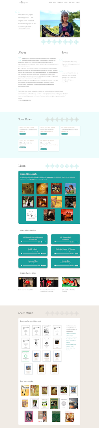
Ex. 2: A simple one-page site with several sections, like Kim Robertson’s above, can display all of your content.
Nail your navigation
Start by planning a simple and clear primary menu directing people to the main areas of your site. Limit your main menu to 5–7 items at most so that people visiting your site can easily find what they need. If you have more content than fits neatly into your main navigation, a dropdown menu or a secondary menu at the start of a page can help drill down your content even further, but be careful not to go overboard—submenus should also contain the fewest links possible. Your menu items don’t necessarily have to link to separate pages—a menu link could jump to a section further down on your homepage, for example. In fact, if you don’t have a lot of content, your entire site could be a single page consisting of several sections. (See Ex. 2)
To help determine what goes into your menu, think of why your audience might be coming to your site. Perhaps someone is looking for concert information, in which case you’ll want an “Events” link. Or maybe a bride is looking for repertoire ideas, in which case you’ll want a “Weddings” link in your main menu with a sub-link to “repertoire.” Curate your navigation carefully, and keep it as simple as possible.
Make your homepage pop
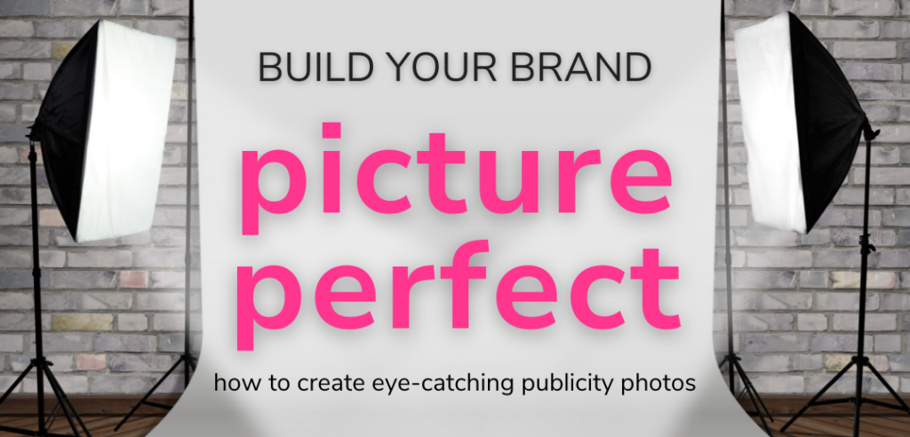
What is the first thing you want people to see when they visit your site? You’ll most likely want a compelling visual image of you and your instrument so people know immediately what you do. If our “Picture Perfect” article (see the November/December 2023 issue of Harp Column) led you to take some great new publicity photos, now is the time to pick your favorite and put it to good use. Choose a dynamic image that will look good across different screen sizes, including tablets and phones. A horizontal orientation is usually best for this reason. (See Ex. 3) But don’t let finding the perfect image stand in your way of creating your website. If all you have is an older image, or you can’t find one that works in a larger format, you can consider combining a smaller photo with some text or a subtle background. (See Ex. 4)

Ex. 3: Choose a dynamic photo for your homepage that will work well across many screen sizes—a horizontally oriented photo usually works best like the photo above on Emily Levin’s homepage.
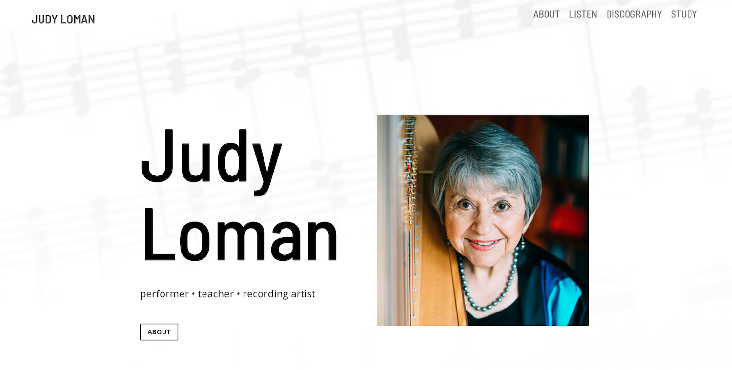
Ex. 4: Smaller photos or vertical photos can work on a homepage by combining the photo with some text or a subtle background, like Judy Loman’s homepage above.
Your homepage can be a place to give quick bites of information that lead to the other areas of your site. For example, you could highlight your next concert with a link to your full event calendar. An audio or video sample could prompt viewers to a separate page with your full discography. A client testimonial might direct job inquiries to a section giving more details about your services. If you maintain an email list or social media accounts, this is a good place to mention those as well, along with asking people to sign up and follow you. Use call-to-action commands like “contact,” “listen,” and “book now” to prompt viewers to take a specific action. Refer to your color palette when adding buttons and links to make sure elements are consistent throughout your site. (See Ex. 5)
Arrange your content

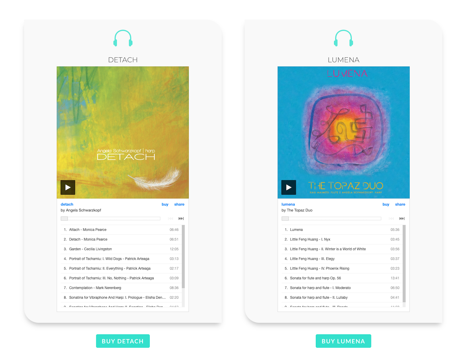
Ex. 5: Use call-to-action commands to prompt viewers to take a specific action when visiting your website, like in the use of the “buy” button on Angela Schwarzkopf’s website and the section headings “Listen” and “Study” on Jaymee Haefner’s website above.
As you plan how your content will flow from section to section or page to page, consider design aesthetics like margins and “white space.” Put on your editor’s hat to make sure your text is clear and doesn’t include more words than you need to get your message across. Review each section to make sure colors and sizes are consistent throughout your site.
If you’re stuck for layout ideas, check out some pre-made templates or “themes.” Premade layouts will generally follow best design practices and are a good place to start with customizing your own content. Websites like Webdesign Inspiration and Awwwards can also provide some inspiration. If you’re working with a designer, they should be able to give you suggestions for how to arrange your content in the best way.
Mobility issues
As you dive into the design process, it’s important to consider all the different ways people will be looking at your site. A layout that looks great on a desktop device, for example, may not work well on someone’s phone. You’ll want to check every page and section to be sure it looks good in desktop, tablet, and mobile versions. Most website builders have a built-in tool for this, as well as a way to show, hide, or customize content based on screen size. Font sizes, images, and layouts for individual sections may need to be adjusted accordingly.
Another thing to keep in mind when designing your site is accessibility for viewers with visual impairments. Avoid color combinations that are hard to read, and consider using “alt tags” in your images. The ADA offers accessibility guidelines on its website.
Give them what they need
Ex. 6: Embed large audio and video files from services like YouTube and Spotify to use less space on your site.
Your website is a great place to provide information and resources for concert presenters and the press. Consider including:
- Bios of different lengths
- High resolution images suitable for print
- Concert proposals
- Audio and video demos
- Links to other press features you’ve recently received
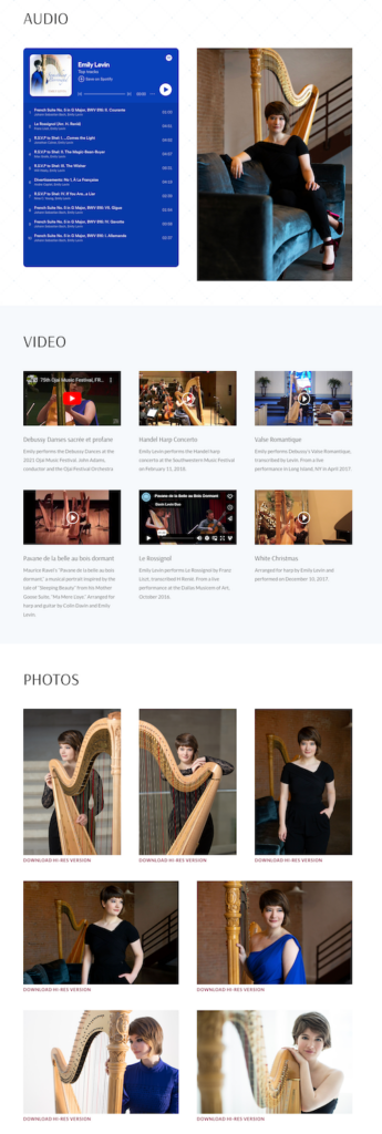
Since some of these items may require a lot of bandwidth, you can also consider including a link to a service like Dropbox rather than storing items directly on your website. Audio and video files in particular will take up a lot of space, and are best embedded from services like Youtube and Spotify rather than stored directly on your site. (See Ex. 6)
More content considerations:
Borrow content from other sources—You may not have to look far to beef up your site with great content. If you already post about your harp life on platforms like Instagram, YouTube, and Spotify, you can embed those feeds directly onto your website.
Sharing is caring—Timely items like news and events can appear in “blog” format—i.e. posts ordered by date that scroll off at a certain point. This makes it easy to keep the focus on what you’re currently doing and also to share your news on social media or in email blasts focusing on a particular topic.

Ex. 7: Consider bolstering your content with a testimonial display like this from Angela Schwarzkopf’s site.

Ex. 8: A “Sign up for news” form like the one from Emily Levin’s site can connect directly to an email service.
Testaments of success—If you’re using your website to book gigs, nothing speaks to your credibility more than a satisfied customer. Consider a testimonial display from recent clients along with photos of the corresponding events. (See Ex. 7)
Making contact
How do you want people to contact you when they visit your website? Your contact info can be as simple as displaying your email address in the footer, which appears on every page. Consider turning your address into a toggle or a link—the words “contact me” for example (use mailto:suzyharpist@gmail.com for the link format)—to make it a little harder for bots to find it.
Another way to ask people to contact you is through a form. When someone fills out your form, which can include specific questions, your website will send the response to you as an email. Depending on the website platform you choose, you may also be able to store form responses directly in your website to find later. While convenient, forms also open you up to spam and you may need to add further spam protection to your website.
If you maintain an email list, you’ll also want a way to allow visitors to “opt in” to receiving your email updates. Consider a checkbox on your contact form, or better yet, a separate “Get news” form that connects directly to an email service like Mailchimp or Constant Contact. (See Ex. 8)
Wrapping it up
Think of building your website the same way you might think of preparing a concert program. Starting with a blank page can feel overwhelming. Break the project into smaller pieces, identify the essential elements you want to include, and settle on an overall “look” you want to achieve. Then you can go to work on the details of each piece, whether you tackle it on your own or call in some expert assistance.
We hope the tips provided in this article and throughout our “Build Your Brand” series give you the tools to help you shine as bright as your music. •
Tech glossary
Domain: your address on the web (e.g. suzyharpist.com). You can use a service like hover.com to see if your domain name is available and if so, register it. Some website builders also provide domain registration.
ECommerce: selling things on your site. You’ll need to do some additional setup to accept payments, link your bank account, and sell products. You’ll also need to consider sales tax and shipping, if applicable.
Host: the service that provides a home for your site. If you’re using a website builder that doesn’t include hosting (WordPress, for example), you’ll need to choose a separate service to host it. These can range from inexpensive (GoDaddy) to premium (like Kinsta, which we use here at Harp Column) depending on how complex and large your site is.
SSL Certificate: verifies ownership and keeps your site secure. Your host can usually provide this for an additional fee, or it’s often included with a full service website builder or premium hosting company.
Template: a pre-designed layout that you can customize with your own photos and text. All the popular website builders have template options.
Website builder: the platform you choose to build your site. Squarespace, Wix, and WordPress are all popular builders.